Every page on your site is a landing page for organic search. Whether searchers convert — or even make the next click deeper into your site — depends on myriad search engine optimization, customer experience, and design choices.
First, remember that every page is a landing page. I do mean every page – not just the pages you plan as landing pages. Your FAQ pages, expired coupons, categories with six filters applied, discontinued products: All of these pages can be landing pages in organic search in addition to the pages you intend your customers to see and use to convert.
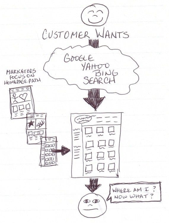
When searchers land on your site, do they know how to proceed?
I like to visualize the organic search customer journey as a shopper dropping randomly from the clouds and plopping down in the middle of the site like Dorothy did in the Wizard of Oz. We need to make certain that those organic search shoppers know where they are, how to proceed, and why they want to do business with your store instead of another.
In reality, the shopper searched for something specific, so presumably the search engine has landed him on a relevant page, but if he can’t determine that immediately he’ll likely bounce back out and try a competitor’s site. That means lost sales.
But over time, as more shoppers bounce out quickly, it can also cause search engines to algorithmically determine that your page is not serving customer needs and lower it in the rankings. This, in turn, means fewer shoppers will click to your page, which means fewer sales overall.
Ecommerce merchants often presume that shoppers will start at the home page and proceed obediently through the site until they convert. It’s important to remember that organic search customers behave differently because their method of entrance is unique.
Category and Filter Pages Are Key
Here’s a case in point. A consumer wants to buy a pocket watch stand to display his grandfather’s watch. Naturally, he searches on Google.

Google organic search results for “pocket watch stand.”
In this case, category pages for Ebay, Pocket Watch Site, and Pocket Watch Central occupy positions two through four in my Google search results. Amazon’s product page ranking at number one is an outlier, not because it’s Amazon but because the page ranking is a product page. This is more common with the ecommerce giants, such as Amazon, Walmart, and Target.
The vast majority of searches are non-branded and category related, meaning they don’t mention specific store or product brands. The search for “pocket watch stand” is a good example. The shopper wants something but doesn’t know or specify where he wants to buy it or who should manufacture it.
These searches will likely land on your category or filter pages because they send the strongest relevance and authority signals for non-branded keywords. The page name is typically descriptive of the products contained in that category.
When the platform uses those relevant, descriptive page names in the title tags, headings and navigational links, the product catalog’s category and filter pages send naturally relevant signals. I’ve addressed this previously, at “SEO: Impact of Ecommerce Catalog Structure.”
Knowing that most shoppers referred by search engines will land on a category or filtered category page, you can see how important it is to ensure that customers know exactly where they are when they land, and can identify exactly why they should trust your store and purchase items from it.
Organic Search Conversion
The flow for organic search shoppers is not a single path. It’s an optimize-for-every-page effort.
As you read through the following resist the impulse to say, “Yup, got that covered.” Instead, put on a mentality of, “If this were the first page I saw, how can I make it easy to take action?” There’s at least one thing you could improve for search-referred shopper, no matter what site you manage: Make it your goal to find as many as you can.
To begin with, every page needs to have a visible and comprehensible headline that orients the shopper upon landing. The breadcrumb is not enough. These shoppers haven’t followed a click path to get to the page they landed on, so they don’t know where they are in your site. Tell them, clearly.
To begin with, every page needs to have a visible and comprehensible headline that orients the shopper upon landing. The breadcrumb is not enough.
If they’ve landed on a filtered page, they need to know that this page is for “Silver-toned Pocket Watch Stands” as opposed to just “Pocket Watch Accessories.” This enables them to navigate more quickly and mitigates the impulse to bounce back out because they’re not sure they’re in the right place.
The next step is to make it very clear what they can do next. If they land on a product page, they should see the product’s name, a nice product image, the price and availability, shipping costs, features and benefits, and a clear button to add to cart. Depending on the product there may be other necessary items like color, size, and make and model.
If your product page has extra white space that pushes this necessary content below the fold, and if your conversion rates from organic search are low on product pages, this is a good place to start. Think about it: Would you buy a product from an unfamiliar store if you had to work to find the information to ensure that it’s the right product? Neither will searching shoppers.
It’s also possible that searching shoppers who land on your product page might want a product you sell, but not the exact one that the search engine landed them on. Make sure to show some related products, and to offer breadcrumbs and clear navigation back to a category page.
Without these, the search-referred shopper may not bother to wade through confusing menus to find a product that may be on your site. The goal is to ensure that it’s not easier for the shopper to just bounce out and try another search result.
Informational Content Useful
If your site lures shoppers in with good informational content, make it easy to move to related products. Some ecommerce marketers feel that including ecommerce navigation on an informational piece of content will scare information seekers off.
But if the information is relevant and useful, those information seekers may instead decide right there to shop and purchase. Why make it hard for them? Place that article directly in the category it’s most relevant to. For example, Nordstrom’s excellent Bra Fit Guide is housed within its bras category so that searchers who land there can shop and convert directly.
A special note about offering articles in PDF form: Think long and hard for ecommerce. The chief concern is that it’s more difficult for the consumer to shop and purchase when they’re stuck in a PDF file. Yes, you can embed links in a PDF and, yes, there’s more freedom for creative expression in a PDF file.
But you need clear navigation and related links if your end goal is conversion. Make sure they’re included, or you’ll have given the shopper helpful information but made it difficult for him to thank you with his wallet.
Do Searchers Know Your Company?
The last thing to consider for search-referred shoppers is that they may not know your brand. For those who skip the home page based on organic search entry, they haven’t been exposed to the brand-building features that make other shoppers more comfortable with the site.
What key features do you need to communicate to your shopper to help her choose buying from your site? Is it free shipping, years in business, a safety verification, returns in store, helpful chat service? Whatever it is that makes your ecommerce site stand out from your competitors, whatever you think the shopper needs to see to buy from you rather than the competitor, that needs to be communicated on every page.
Speaking of every page, one of the things that scares shoppers faster than anything is landing on an outdated looking site. I know it’s not fair, but if your site looks like it’s from 10 years ago, people may assume that the financial systems are outdated as well. Appearance matters, and it might hurt your chances to sell your products and provide your terrific customer service.
Speaking of every page, one of the things that scares shoppers faster than anything is landing on an outdated looking site.
The pocket watch stand example was based on my experience this week searching for an anniversary gift. I’m sorry to say that I bypassed two highly-ranked sites based on their appearance alone.
If you’re converting organic search traffic at a noticeably lower rate than the rest of your traffic, think long and hard about the above. Searchers drop in without context and make a snap decision whether to stay and shop or find another retailer. Look at your site through their eyes, to identify potential problems.


