The checkout process is the last step in completing an online transaction and making a sale. A well-planned checkout experience can significantly boost conversions. Leading online retailers have made their checkouts more adaptive, rewarding registered users, and giving site visitors plenty of opportunity to purchase more.
I looked at how 10 leading online retailers managed the checkout experience. The hope is that these 10 big brands can demonstrate the proper way to close an ecommerce sale. Interestingly, however, some of these brands don’t use what experts believe are the best practices for providing a good checkout experience. Do these companies know something the experts don’t or are they successful in spite of their idiosyncrasies?
10 Leading Online Retailers
To look at the checkout process, I stepped through making a purchase on Amazon, Apple, Best Buy, Dell, Macy’s, Office Depot, Office Max, Sears, Staples, and Walmart. I visited each of the sites on June 17, 2013.
For each site, I wanted to learn how quickly I could go from selecting a product to purchasing it. I was also interested in what barriers, if you will, lie between product selection and buying the product.
Each of the sites generally followed the same checkout flow — which is common to virtually every ecommerce business. Shoppers select a product specifying its options; add that item to a shopping cart; provide both billing and shipping addresses and contact information; provide payment information like a payment card number; and receive some form of order confirmation. But there were two areas that stood out for these 10 retailers: (a) giving shoppers the opportunity to make additional buys, and (b) the registration process.
Would You Like to Continue Shopping?
Giving a shopper ample opportunity to keep shopping was certainly a trend with the ten retailers.
For some time, it has been a best practice to offer shoppers the option to continue shopping from the first page of the checkout process. Often the “continue shopping” link was text only and relatively small. The idea was to give interested shoppers the ability to add more to their market basket, but not to distract them from making a purchase.
Typically "continue shopping" links are small and in text only.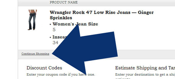
But for the retail sites I reviewed, the clear trend was to offer a pop-up or modal window that gave shoppers the opportunity to complete the purchase or keep shopping. In some cases, retailers even emphasized the ability to keep shopping over going directly to checkout.
For example, when a shopper adds an item to the shopping bag on Macy’s site, a modal appears summarizing what’s in the cart and giving shoppers a clear link to continue shopping.
Macy’s offers a continue shopping link on a modal interface.
On the Sears site, shoppers are not only given the opportunity to continue shopping, but also told how many dollars they are away from earning free shipping on the order. This data again appears in a modal interface before the shopper is taken to the cart.
Sears lets shoppers know how much more they need to purchase to get free shipping.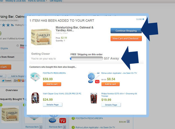
Similarly, Walmart also shows shoppers how much more they need to purchase to get free shipping and offers a link to recommend complementary products.
Walmart encourages additional sales too.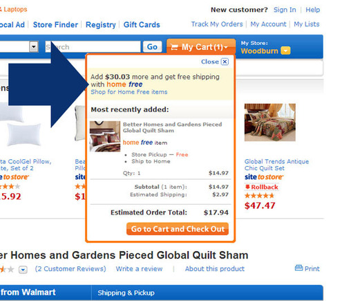
Make Registration Mean Something
Of the sites reviewed, only Amazon required site registration to make a purchase. But Amazon, which is, perhaps, the most recognized and successful online retailer in the United States, makes registration worthwhile.
As a logged in Amazon Prime user, I was able to purchase items with a single click — making the purchase simple and fast.
Amazon offers one-click checkout to logged-in Prime members.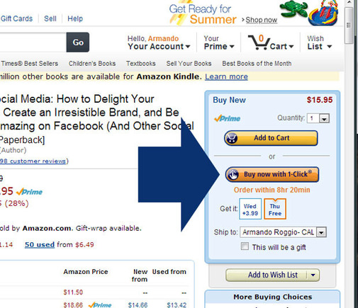
When not logged in, the Amazon checkout flow took five clicks, not counting clicks between form fields.
For most of the sites, traversing the checkout flow took about five to eight clicks, again not counting any clicks to move between form fields. In every case, checking out as a registered user significantly reduced the number of steps needed to complete the transaction. In this sense, the retailers reviewed were providing a tangible benefit to being a registered user. This is actually not unusual though since many ecommerce platforms offer similar advantages.
These retailers generally did a good job of describing the benefit to registering. Sears was straightforward, offering four reasons to register.
The Sears site explains the benefits of registering.
Macy’s, as another example, offered an express checkout link, indicating that if users where registered they could skip a significant portion of the checkout process. In this way new customers are encouraged to register to have the express checkout option next time.
Macy’s express checkout link shows new customers one of the benefits of registering.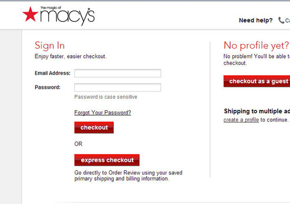
Summing Up
The ten leading online retailers reviewed generally emphasized adding more items to the market basket and did, perhaps, a better-than-standard job of encouraging site registration. In the latter area, Amazon, which required registration, was the most exceptional.
In the checkout flow these retailers were very similar to what one might find on any good ecommerce platform.


