I’ve said many times that store pages need a definitive call to action. I fear, though, that I’ve been remiss in explaining what a CTA is and the importance of its design and placement. In this post, I’ll look at examples of CTAs to determine what works best for your online store.
What Is a Call to Action?
A call to action tells shoppers what to do. The action can be anything from learning more about a product to finalizing a purchase. On a product page, the CTA would likely be the “Add to Cart” button. On a landing page it could be a “Learn More” or “Customize Yours” button. Ideally, it’s the most important action you want the shopper to take.
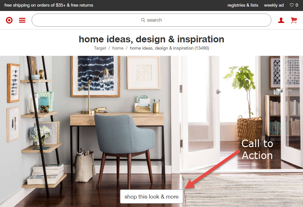
Stellar photography and a simple CTA to promote a specific look or theme works well for home decor. Source: Target.
The CTA isn’t necessarily a prompt to purchase. It can be used for the collection of data (such as encouraging a visitor join the email list) or to determine what your audience wants (by asking questions).
How to Use Calls to Action
CTAs can be used to do one or more of the following.
Promote the direct purchase of a product. Via “Add to Cart” or “Checkout Now” buttons.
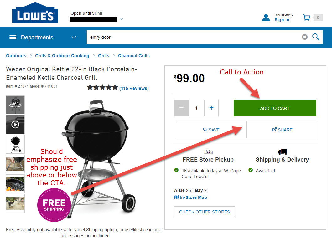
The most common CTA is the “Add to Cart” button. Incorporate compelling, salable text for a bigger impact. Source: Lowe’s.
Promote product knowledge. “Learn More” or “Browse All” buttons.
Share with others. Social sharing links or buttons.
Sign up for email newsletters, text messages, or contests.
Highlight sale and clearance items. An “On Sale” CTA can be used to add value to the store or brand, while a “Clearance” CTA can be used to make room for new product lines.
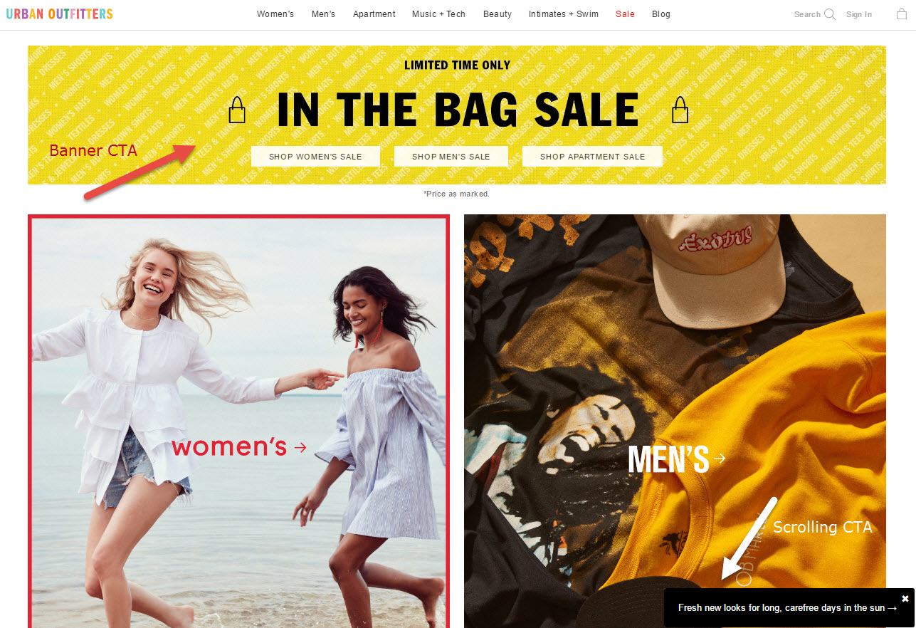
Using top-of-page banners to promote sales and special features can work well. Urban Outfitters also uses a scrolling slide-in feature to entice shoppers to peruse new looks for the summer.
Ask for information. By asking visitors specific questions, they will be prompted to share info, such as details of a personal experience or photos. This type of CTA could be used to learn more about the customer or as user generated content on the website. Questions can also be asked in an attempt to boost engagement — much like a blogger may ask for others to chime in to a discussion.
Promote upsells. Often presented as add-ons or discounted additional features, upsells help increase the value of an order. Properly implemented CTAs can help boost conversions by decreasing cart abandonment as well as increasing overall average order values.
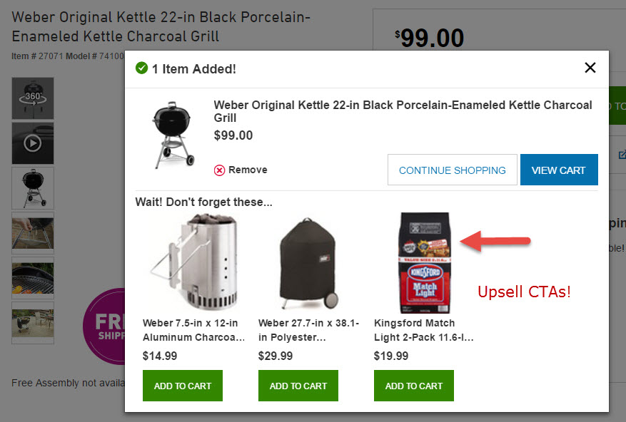
Upsell CTAs help boost conversion and average order values, especially if they’re offered at a discount. Source: Lowe’s.
Depending on your audience, you may want to implement one or more of the above, or test other types of CTAs. Regardless, the way the CTA is formatted plays a big role. CTAs must be compelling, and this includes both the design and text that appears above, below, and within the button or banner — yes, banners can be used. The action must be clear, and first-person wording works best. A sense of urgency is key in most situations, whether it is based on a sales price, available inventory, or special offers. Finally, the ideal CTA is impossible to miss on a page. It stands out from everything else without being too distracting.
Testing CTAs
It’s critical to test multiple elements of calls to action.
Colors. There is no definitive color that converts the best, and colors are dependent on the existing color scheme of the site. In most cases, include white space around the CTA and use a color that makes the button stand out.
Simplicity. Don’t get too crazy with button design and wording. If you can’t create a branded, simple button, rectangles and squares always work. The button itself should include only a few words.
Narrative. First person narrative (“Sign Me Up,” “I Want In,” “Send Me Emails”) works better than third person (“Get Yours,” “Place Your Order”). The absence of narrative may not appear to hurt, but your analytics will likely show that a simple change like that from “Sign Up” to “Sign Me Up” increases CTA clicks.
Location. CTAs should most always be placed above the fold — i.e., the upper portion of the screen for all devices.
Popovers. Despite complaints from visitors, many leading e-tailers use popovers. Be sure to test exit rates, bounce rates, and conversions against the use of popover CTAs.
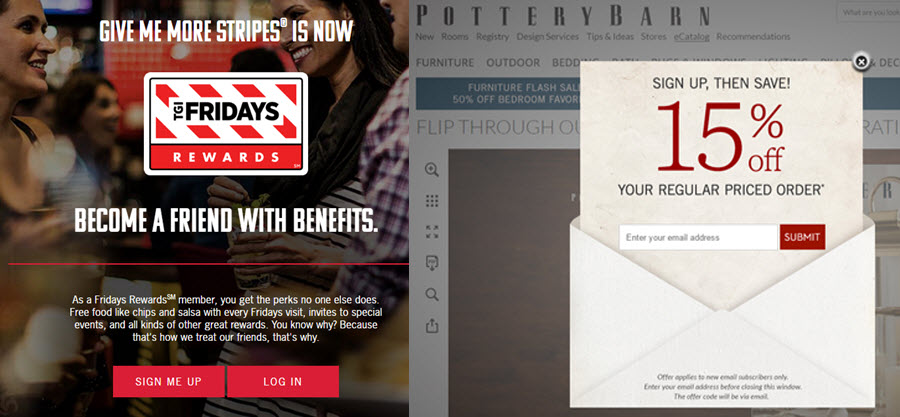
Different business types call for different CTAs, as shown in these examples from TGI Friday’s and Pottery Barn. Be sure to test language, placement, and delivery.
All testing is meaningless if you aren’t going to track changes and analyze the results. In Google Analytics, use annotations to track the success of CTA changes. Go to Behavior > Site Content > All Pages and locate the page where the change was made.
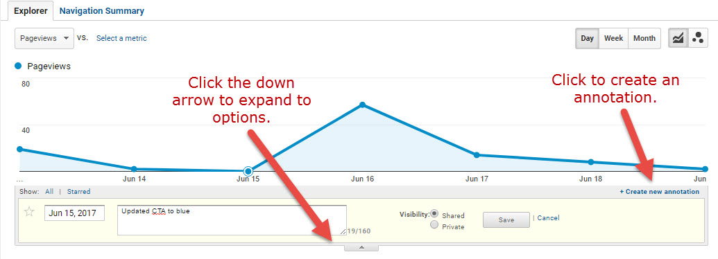
Using annotations in Google Analytics, briefly describe the change made to the page. You can backdate the annotation if necessary.
In short, definitive CTAs are key in maximizing page views and conversions. Without them, visitors see store pages as information sources, rather than gateways to the checkout.


