The depth of keyword data available to search marketers has varied widely over the last couple of years. This week, Google AdWords made several enhancements to its Keyword Planner tool that expand the amount of information available and the ability to quickly visualize it.
With its focus on paid search, some of the updates around location and estimates aren’t relevant to search engine optimization. Here I’ll focus on the ones that are most interesting to SEO.
Keyword Demand Trend Charts
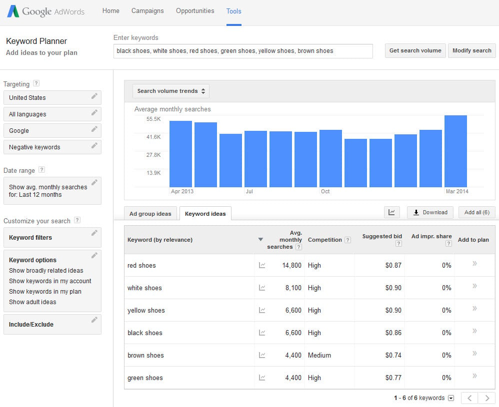
The most visible addition to Keyword Planner is the charts at the top of the page. As usual, enter some words into the “Get search volume for a list of keywords or group them into ad groups” field of the keyword tool to receive keyword data. Instead of just receiving a chart of keywords and numbers, the resulting page is now topped with a graph displaying the monthly trend for those keywords over the last year.

Instead of just receiving a chart of keywords and numbers, the resulting page is now topped with a graph
The example above shows a request for data on six shoe keywords. The blue bars show the combined search volume for all six keywords by month over the last 12 months. Mousing over each bar shows the number of searches in that particular month. This new graph feature is very useful if you want a quick view into the trends or seasonality of one or more keywords.
The chart below the graph details the monthly average search volume by keyword, as it always did in Keyword Planner. Mousing over the little graph icon to the right of each keyword pops up a smaller graph that displays the keyword trend for that individual keyword.
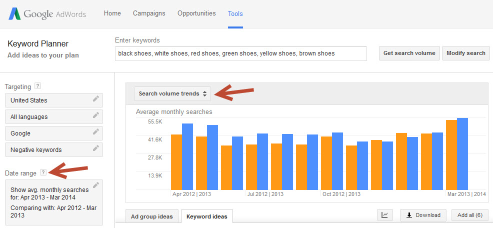
In addition, Keyword Planner now allows you to set the date range. In the “Date Range” section at the left, choose any start and end month from April 2012 to March 2014. The tool will display the keyword data from those months in the graph. Presumably this will be a rolling 24-month period, with next month allowing May 2012 to April 2014 as possible date range options.
Click the “Compare” button in the Date Range section to show the data compared to any other date range, as shown below. Year over year is the most obvious choice when comparing keyword trends, but you could also analyze keyword volume before and after a certain date.

Click the “Compare” button in the Date Range section to show the data compared to any other date range
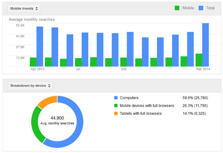
Search Volume Trends is just one of the three graphs offered, though. Click the selector at the top of the graph to choose another view, such as “Mobile Trends” or “Breakdown by Device,” as shown below.

Click the selector at the top of the graph to choose another view, such as “Mobile Trends” or “Breakdown by Device.”
AdWords’ previous Keyword Tool had the ability to segment keywords by desktop and mobile, a valuable piece of data. When the tool was discontinued in favor of the Keyword Planner, search marketers lost that data. These charts seem to be AdWords’ way of giving the data back.
However, to examine the device data for each individual keyword you’d need to enter each one into the tool one at a time. There’s no way to download this information in the way we could before.
Downloading Data
Keyword Planner always enabled you to “Segment statistics by month” after clicking the download button. That part hasn’t changed. AdWords added the ability now to download the data according to the date range selected, whether it’s 2 months or all 24.
The download feature isn’t as fully functioned as it could be, though. The data in the trends charts is not downloadable. For example, if you want to download the data in the date range comparison charts to Excel to analyze it against other data, you can’t. Only the data from the first date range will be downloaded, not the comparison date range. To get all of the data you’d have to reset the data range to encompass all of the months in the original and comparison ranges, and download them that way.
As mentioned before, the mobile and device data aren’t downloadable at all. By mousing over the individual data sections in the bar and circle chart you can see the counts for that device. A very dedicated person could input them all in a spreadsheet manually in this way. It’s really not scalable, however. Hopefully this is an intermittent first step toward re-enabling download for device-based keyword data.
Search Volume vs. Keyword Ideas
To this point I’ve been showing examples from the “Get search volume for a list of keywords or group them into ad groups” function of Keyword Planner. When used with the “Search for new keyword and ad group ideas” function, the data serves a completely different purpose.
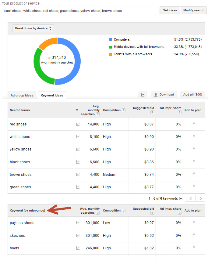
For example, the image below shows the same six shoe-related keywords, but input into the keyword ideas function instead of the search volume function. As a result, Keyword Planner returns the six seed keywords plus 800 related keyword ideas. Instead of showing 44,900 average monthly searches, the graphs now show 5,317,340 average monthly searches for the same time period.

This image shows the same six shoe-related keywords, but input into the keyword ideas function instead of the search volume function.
Each of these keyword ideas are relevant in some way to the six “search terms” entered into the tool, but not all are relevant to the specific keyword set you’re researching. For example, if you’re researching “red shoes,” it’s unlikely that “payless shoes” will be relevant to your keyword set. After narrowing down the keyword ideas to show only the ones relevant to your keyword set, the graphs displayed will be more representative.
Using the graphs with the keyword ideas function could be especially useful when you want to know the keyword value of the universe of a specific set of keywords, and you want to trend it over time.
I’ve previously addressed the basics of using Keyword Planner and on how to use the features to narrow down keyword ideas, at “SEO: Getting More from Google’s Keyword Planner.”


