Creative content is the cornerstone of a successful email campaign, driving opens, clicks, and purchases. In this post, I’ll review the essential creative components of high-performing campaigns.
The Basics
The first step is an effective email template. The fundamentals include:
- Layout. Single-column designs are the easiest to optimize for mobile devices.
- Text and images. In my experience, the best emails are roughly 60% images and 40% text.
- Dimensions. A width of 400 to 600 pixels renders well across all devices. Length can vary based on the message, but longer emails increase load times.
- Fonts. Stick to popular fonts such as Arial, Calibri, Georgia, Times New Roman, and Verdana. Lesser-used fonts will not function well across all email programs.
- Size: Keep the file size under 100 KB. The smaller the size, the quicker the email will load and the higher the likelihood that recipients will read the content.
- Code. Emails must render well on all devices — desktops, tablets, smartphones. Smartphones now account for as much as 75% of all opens. Avoid excess HTML or tags that can trigger spam filters. Use a plain-text editor to copy and paste text, not Microsoft Word or similar, which could cause hidden formatting errors. Never include JavaScript or Flash, as they are not supported in email clients. And avoid embedded forms.
- Regulatory requirements. Include in the footer an unsubscribe link and your company’s physical mailing address — the U.S. CAN-SPAM Act requires both.
Overall Design
Marketing emails should be simple, clean, and easy to read.
- Headings, subheadings, and white space help organize the message. Isolate the call-to-action to stand out.
- Fonts should be no less than 12 to 14 pixels on desktops, 16 pixels on smartphones.
- Colors. The fewer, the better — no more than three.
The design should always support the four W’s:
- Who the email is from.
- Why it is relevant to the recipient.
- When the recipient should take action.
- What to do next.
The clearer you convey these four elements, the better chances of conversion.
Images
- Width. Images can be wider than the template (for higher resolution) and then sized down using the image attributes or CSS.
- Alt text will display when an image does not load or is blocked by the user. Alt text should therefore carefully describe the image to help users understand its purpose.
- Include people. In my experience, images containing people outperform those that don’t.
- Relevancy. Make sure the image supports the purpose of the email.

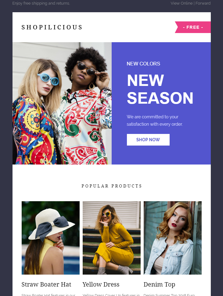
This template example from Shopilicious has a good ratio of images to text. Also, the call-to-action (“Shop Now”) is near the top, providing a clear direction for the recipient.
Video and GIFs
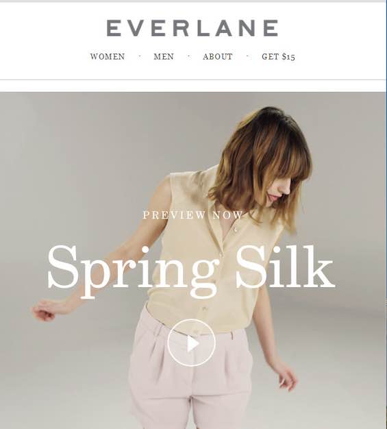
Videos and animated GIFs can encourage clicks. But not all email clients support video streaming in the template itself. This includes Outlook and Gmail. The best work-around is to include an image with a play button overlaid that links to a web-hosted video. (However, roughly half of email providers support embedded HTML5 video.)

Everlane shows a play button on top of an image in this email. Clicking the button takes the user to the hosted video.
—
All email clients support animated GIFs. But keep the file size to 1 MB or less.

All email clients support animated GIFs, such as this example from Starbucks.
Mobile Optimization
Responsive email design will automatically adjust the template to the recipient’s device. Other helpful mobile practices include:
- The call-to-action button should be large enough to click with a finger (at least 44 x 44 pixels with 16-pixel minimum font size) and as close to the top as practical.
- Single column formatting only.
- Line spacing of at least 1.5 times larger than font size to create sufficient white space.
- The logo should be top center or top left.


