Online stores need a healthy balance of landing pages, especially for anchor products and product categories. Landing pages have a specific goal, such as getting people to sign up for email newsletters or purchase a product.
Landing pages also put 100 percent of the focus on the task at hand by presenting compelling text and media, and by minimizing distractions, such as related products and complex navigation.
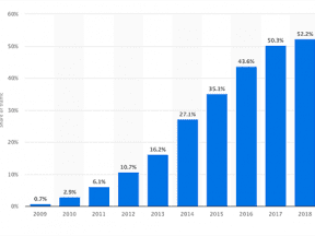
These standalone pages are crucial to boosting conversions during marketing campaigns. According to Monetate, a customer experience platform, about 25 percent of online shoppers start their journey at product pages, yet more than 70 percent of them are likely to leave the site immediately. That’s because the bulk of these shoppers aren’t ready to purchase.
The referring channel also plays a role, with direct traffic accounting for the highest product page bounces.
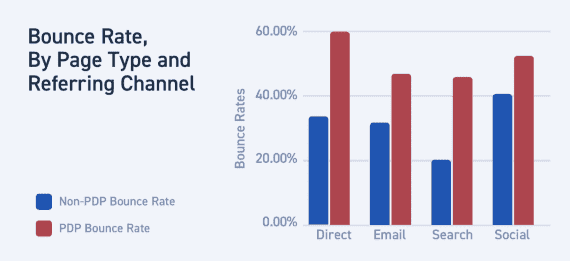
Stats show that product pages have the highest bounce rates, especially when reached via direct traffic. Source: Monetate.
Landing pages bridge the gap between well-designed teasers in the form of social posts and ads and detailed product pages. They also help engage shoppers landing from search engines, as well as those who visit the site directly.
Study your store’s analytics and you’ll likely see that product pages have higher bounce rates than category pages, search results, and the home page. This isn’t a fluke. Product detail pages typically result in fewer page views, conversion rates, and average revenue per shopping session.
The latest studies continue to support what we’ve known for some time. When visitors land on a page, they take just a few seconds to determine if staying there is worth their time. If there is no clear message and call to action, even if the product is a good fit for them, they will most likely leave the site. Since home, category, and product pages contain more than single concepts, they don’t convert as much as landing pages.
Engage and Entice
When creating landing pages, consider both the type of shopper and the referring website or channel. You may want to build different styles of pages for different networks, but an ideal landing page includes all relevant data while eliminating useless jargon. It speaks to the target audience and gets people excited to buy or tell others about the company or products it sells. With this in mind, use words that trigger the “need to own” emotion.
For example, the screenshots below for a scrollable landing page for the Nest Learning Thermostat focuses on minimalism, ease of use, and families. It calls just enough attention to its app so techies understand what they can control, but it doesn’t intimidate older audiences that would be more apt to turn its dial. It also presents an impressive stat — the amount of kilowatt-hour of energy Nest thermostats have saved since the products hit shelves in 2011.
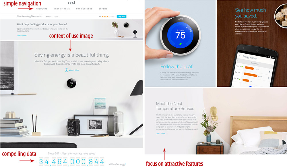
These screenshots from Nest’s scrollable landing page relies on simple navigation and minimalist living. Click image to enlarge.
—
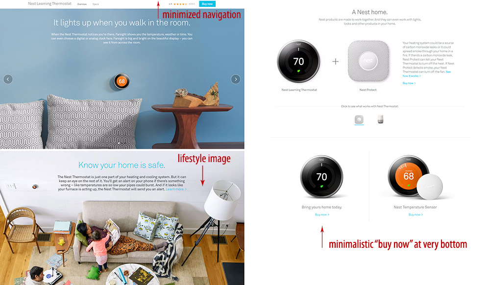
Nest focuses on family safety and comfort, as shown on these screenshots from a single landing page. Click image to enlarge.
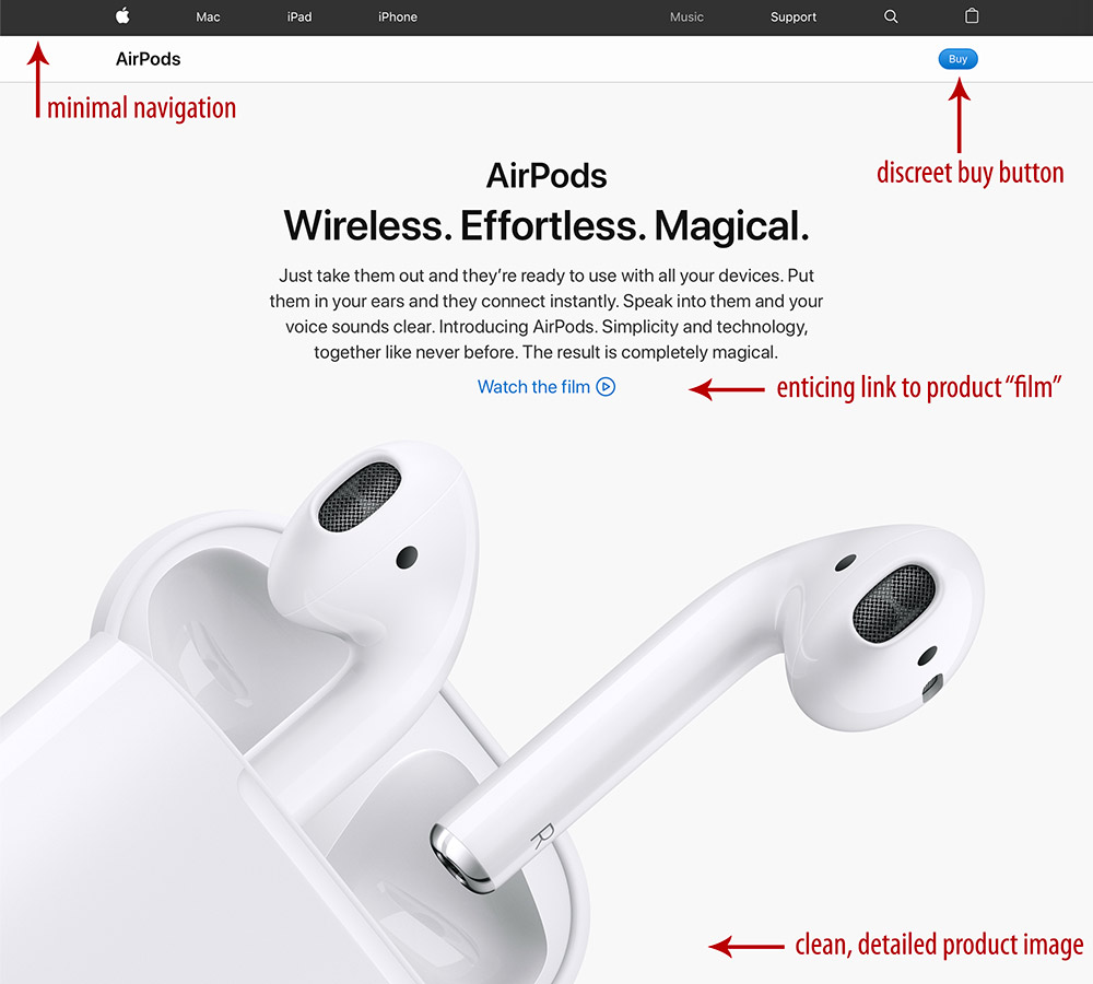
Apple takes a more creative approach by using fewer words and less complex images. The AirPods landing page uses a larger-than-life image and three simple words that drive the need to buy: Wireless. Effortless. Magical. The page design is so clean that only a link to a video, which opens in an overlay, is presented.
—
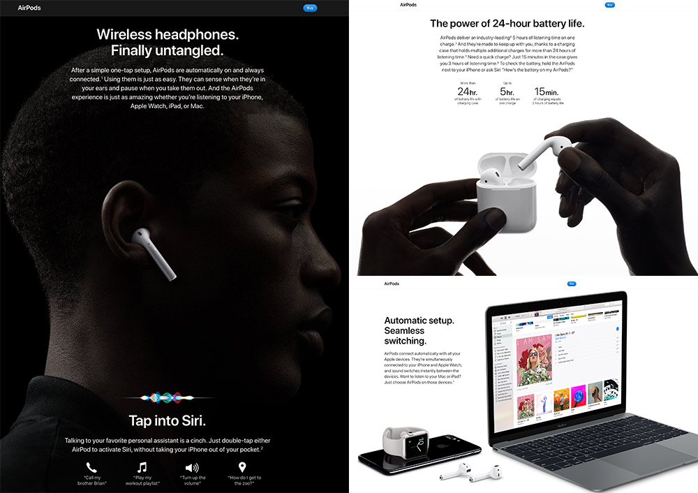
The AirPods page includes everything Apple’s broad audience members presumably want to know — and no more. Click image to enlarge.
As we scroll the page we see more simple words and stellar imagery. The page calls out core tech specs and vows overall simplicity. While it’s easy to think Apple just wants to show off its ability to communicate, the company is focusing on immediate engagement. This type of marketing is what makes Apple so attractive to users of all ages.
What to Incorporate
While there are no rules of what a landing page must include other than engaging content and a call to action, most should incorporate the following.
- Stellar imagery. Images that evoke emotion are best, followed by context-of-use and showcase photos of the product from different views. A 360-degree view is good for technology, footwear, and appliances, so long as these are shot at high quality.
- Compelling video. Depending on the layout, video can be embedded or be activated via a link. Try to keep landing page videos short — a minute or less works best. And use simple, short headlines. Bold and easy-to-read headlines tell the core, while explainer text goes into more detail.
- Minimal navigation. Provide a means to view other pages, but navigation should not distract the task at hand. The most successful landing pages make it easy to browse the rest of the site without interrupting the process of learning about the product.
- Price, but only if it’s a big part of the message. Whether or not to display a product price on a landing page depends on the goal and the brand. If it’s a common product that you sell at a more competitive price, it makes sense. But if what you’re selling is a true experience that really can’t be bought elsewhere, a simple buy or learn more button may suffice.
Revise and Perfect
By the way, contrary to popular belief, the call to action doesn’t necessarily have to be big. In the Apple and Nest examples above, the buy button is in its own bar at the top of the page. Done right, a landing page gets shoppers so excited they have to click it, so just make sure it’s in a prominent location.
Designing the best landing pages for your store can take some time. It is imperative you study the site’s analytics to see if a page has helped decrease bounce rates and increase conversions. It can take many revisions, especially with ongoing changes in technology and shopping patterns. When it’s nearly perfect, you’ll know.

