“How do I boost conversions?” It’s often the number one question from smaller online retailers.
The question has potentially thousands of answers, and there is no cookie-cutter plan that suits every store. Also, let’s not confuse conversions with sales amounts. Chances are you’d rather make more money, even if that means a slightly lower conversion rate.
Years of experience and data tell us, however, that there are some common themes when it comes to inspiring visitors to click that call to action. You may be surprised how well some quick-and-easy changes can perform. The exact messaging and design is dependent on your target audience, so be sure you understand exactly who your ideal shoppers are.
7 Changes to Boost Conversions
1. Swap main and alternate images. Make sure that the first product image the shopper sees is the best one. It should typically present the product in a setting (or on a model). Alternate views are used to present manufacturer images and for clarification of product features.
For example, a product as simple as Pyrex bowls begs for the proper main image.
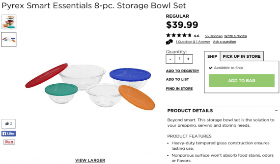
Standard manufacturer’s image. We can see it’s just a set of glass bowls with lids. Source: Kohl’s.
—

The in-setting image gives us a more clear understanding of size, and also shows the lids are sturdy enough for stacking. Source: Kohl’s.
2. Display “Ships Free” next to products and calls to action. If you offer free shipping based on an order subtotal, any product that exceeds that threshold should say so.
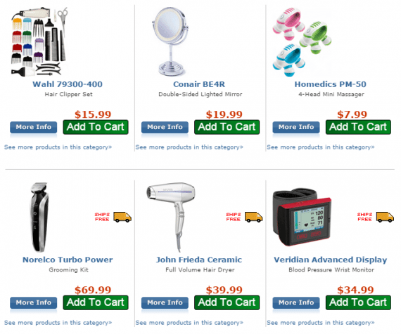
Frys.com offers free shipping on orders of $34 and up. A “Ships Free” truck appears next to every product that qualifies on its own.
Take it a step further by reinforcing the free shipping offer on the product itself.

Amazon reminds us that Fulfillment by Amazon orders over $35 ship free, regardless of the current product’s price.
A simple calculation can be used to display a message if the shopper is only a few dollars away from a free shipping offer.
3. Change the color of the add-to-cart, checkout, and submit buttons. Colors play a big role in the conversion process. Even if you don’t have time to change things up throughout the entire site, this simple step — typically done via CSS — can make a big difference, especially on mobile. Talia Wolf, a conversion optimization expert, goes into great deal about the emotional triggers of color, and many studies show that the majority of online shoppers say color is the reason they buy a particular product.
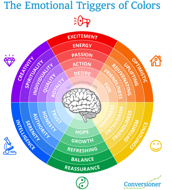
This easy-to-understand chart shows how colors and their shades convey emotion. Source: Conversioner.com.
4. Display accepted payment icons on every page. People who pay with something other than Visa and MasterCard want to know if you accept their method of choice. Letting them know up front not only keeps some people in the store, but it can also increase order totals.
You don’t have to distract shoppers. Place the payment icons in the footer. Source: RetroPlanet.com.
Don’t forget to include icons for any mobile-only methods on the mobile site.
5. Display stock status. If only a handful are left, display the number in stock to create a sense of urgency.
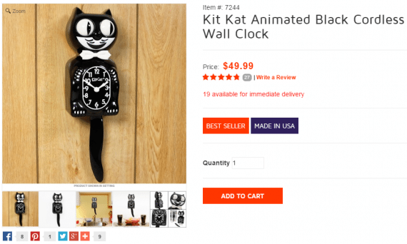
People want to know the item is actually available. The stock status reinforces that. Source: RetroPlanet.com.
6. Place “add to cart” on category pages and search results. This may not work for all product lines, but if shoppers know what they want, don’t make them tap or click to the product page. Speed up the process, especially on mobile.
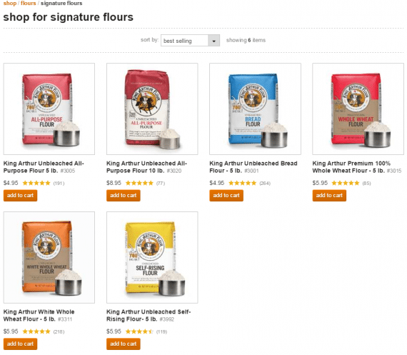
Repeat shoppers should be able to buy right from a product listing page. Source: King Arthur Flour.
7. Increase the font size. Even a slight boost can help keep your shoppers from squinting or zooming. On a responsive site, this change should have minimal effect on the page’s overall layout. In fact, it might make everything look a million bucks better.
Even the smallest of changes can make a difference — hopefully a positive one — so be sure to annotate in Google Analytics or related software. By notating exactly when you made any sort of change you can better determine if the alteration was for the good or the bad.
If you make any of these updates to your store, I’d love to hear the outcome. I’ll read all your comments below.


