Landing pages are important online marketing tools and keys to conversion. So almost anything that a marketer can do to improve a landing page’s performance will also improve the bottom line.
A landing page may be defined as a page on your website where visitors are sent to prompt a conversion — like selling a product or adding a subscriber. Brandon Eley and Shayne Tilley wrote in their book, Online Marketing Inside Out, that “landing pages are your money pages. They’re one of the strongest tools you have to convert visitors into customers. Much of your marketing activity will be geared around attracting visitors to these pages, so the way you construct these will have a significant impact on your income.”
In this article, you’ll find five tips to help you improve your site’s landing pages. For some of these tips there will be relatively more lengthy descriptions, while other, perhaps more obvious, suggestions get a more pithy treatment. Regardless, all of these suggestions are winners.
Have a Single Objective
A great landing page, whether it is a product detail page or an online form, should focus on one singular goal. In the case of a product detail page, that goal should be to convince the visitor to buy the product described. Registration pages seek to collect the visitor’s contact information. Newsletter or contact forms should aim at getting a user’s permission to continue the marketing conversation.
Don’t confuse the visitor or dilute the focus on that single objective. In 2008, Lee Goldberg, a Practical eCommerce contributor, wrote, in “Landing Pages: Five Pointers to Boost Conversions,” that marketers should “get rid of any page element that distracts from the task at hand. Eliminate superfluous text and Flash elements, and make sure your offer and its value are crystal-clear and specific. Make sure your value statements are consistent with your ad text, and keep the text benefit-oriented to give visitors a reason to go to the next step. Use your value statements to break through all of the clutter on the Internet.”
A great example of this principle in action can be found on the 37Signals landing page for Basecamp, a software-as-a-service project management solution. The page clearly states the service’s value, and encourages visitors to get more information.
In short, ask the visitor to do one thing.

37Signals’ Basecamp landing page encourages visitors to convert.
Make It Easy
According to Eley and Tilley, “the easier you can make a process, the more conversions you’ll make. Asking your customers to jump through hoops to answer your call to action will only push them away.”
Often making a landing page easy to use will come down to how the page is designed and laid out. Buttons and form fields should be large, and their purpose should be clear.
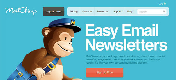
MailChimp, an email marketing provider, has a site that is simple and easy to use. For example, the company’s landing page has a plain call-to-action: “Easy Email Newsletters.”
Make it easy for visitors to complete the action.

MailChimp’s site makes very clear what visitors can do.
Have Impeccable Grammar and Spelling
According to the Kissmetrics blog, “in the example of an online retailer who is asking for visitors to purchase and provide personal and billing information, the trust of the customer will be risked if there are spelling errors and sloppy grammar” on the landing page.
If you need an example of how poor grammar or word choice can do marketing damage, consider a recent Mercedes C-Class commercial. The spokesman in the ad says, “more power, more style, more technology, less doors.” The problem is that “less” should be used with so-called mass nouns like “less water,” “less blue paint” or even “less rain” while the word “fewer” should be used with countable nouns like “doors.”
While the distinction may seem petty to some readers, consider that there have been dozens of articles written specifically about Mercedes’ faux pas. Abe Sauer of BrandChannel even wrote, “Mercedes, this we cannot excuse. ‘Less doors?!'”
For businesses without Mercedes’ reputation, a similar mistake could undermine trust and have visitors leave without converting.
For your landing pages, use spell check, get a style guide — see “Style Guides for the Digital World” — and have an editor, even if that editor is the person in the next desk or just a little further down the counter.
Optimize for Mobile Devices
Marketing intelligence firm, IDC reported this month that “by 2015, more U.S. Internet users will access the Internet through mobile devices than through PCs.”
Not having mobile-optimized landing pages is like not having a website.
Test and Retest
Finally, landing pages must be tested and retested. Whenever possible use A/B testing or multivariate testing to determine just which page elements are lending themselves to conversions.


